For the past several years I have been wanting to learn Python as it has been growing in popularity. Recently I decided to take a few courses at my local university and they required a familiarity of Python. So, I finally began to learn Python and I want to share my experience because Python can be a valuable tool for every simulation modeler.
There is an extensive amount of free online training content
for Python. You will have no trouble finding material to fit your needs. My biggest confusion starting out was regarding
the coding environment. There are many coding
environment options for Python, and I am hoping this information will save you a
bit of time and confusion. I am listing three typical environments below. There
are many others, but I think most of the others are like one of the three
listed below.
- a) You can use Python through the command line environment. That is correct, the command line like in the old days of MS DOS. I am not a fan of this option, but it is an option, and you will likely see it in some of the training material.
- b) You can use python through a code editor environment like Visual Studio Code. I like Visual Studio Code. I have found it to be a great environment if you want to build something like a simple application using Python. It is not the easiest tool to start out with, but it does have some great features.
- c) You can use python through a notebook environment like Jupyter Notebook. To me, this was the easiest environment by far to set up. I think this is the best environment to start out with for a beginner that just wants to do some simple data analysis (tasks like finding the average and standard deviation of a data set) as well as charting results.
I would recommend every simulation modeler should consider
learning and using Python for data analysis and charting tasks. I found Anaconda
to be the easiest
environment to get Jupyter Notebook running with the appropriate modules needed. If you are a fan of Google, Google Colab had the same
“notebook” feel as Jupyter Notebook and it didn’t require any installation.
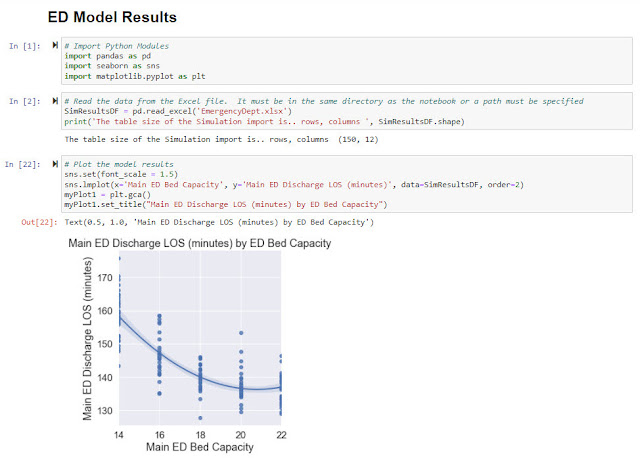
To show the simplicity and usefulness of Python charting, I
set up a study in the Emergency Department model (Documents\ExtendSim10\Examples\Discrete
Event\Emergency Department.mox) using the Scenario Manager (from the Value
Library). I was able to set the Scenario Manager up to change the number of
Main ED beds from 14 beds to 22 beds with a step size of 2. The Scenario
Manager captured the length of stay of the Main ED patients who were
discharged. The Scenario Manager ran each scenario 30 replications and then
automatically exported the results to an Excel file.
Below is an example of a plot set up in Jupyter Notebook. It
takes very little code. The first block
of code is importing the required Python modules. The Pandas module is used when importing data
from Excel into a dataframe. The Seaborn and Matplotlib modules are used for
the plotting functions. The second block of code is reading the Excel file and
putting the simulation data into the Pandas dataframe. The third block of code
is setting up the plot. The dots on the plot are the actual simulation results
where one dot represents one simulation run. The line is a fitted curve that is
automatically shown on the graph.
I used to do this task in Excel by using pivot tables and pivot charts. However, each time I reran the model and created a new data set of results, I would have to recreate the pivot table and pivot charts. The beauty of using a Python script like the example shown here is that is that this code can simply be rerun when new simulation results become available. This is much easier than using the pivot tables.
From this example, you can also see the power of combining
the capability of the Scenario Manager to run experiments with the charting capability
of Python. Coupling these two tools is an outstanding combination.


No comments:
Post a Comment